I have been having so much fun playing with the new Bella Blvd releases!! The are all amazing! :)
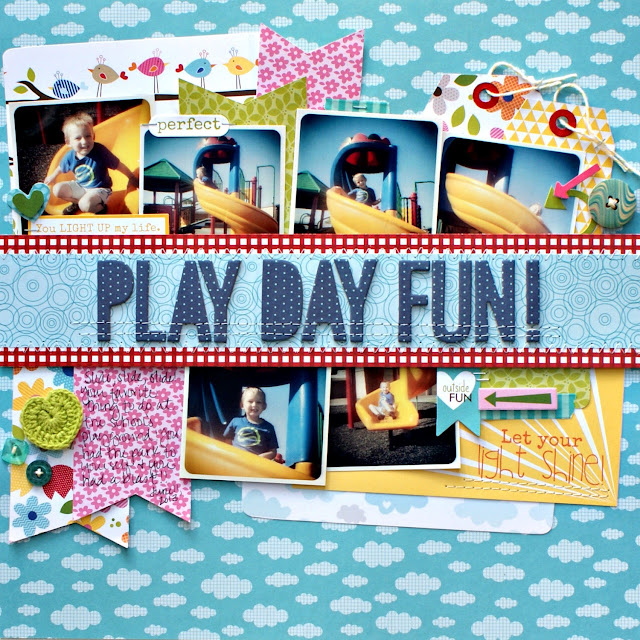
Here is my newest layout using the Play Date collection...
I had so much fun making this layout. But, let me tell you...it gave me fits most of the way through it! I had the idea to have the title across the layout, and have the photos tucked into it. I wanted them to look like layers, like the banners and tags and other pieces sticking out...
It was hard, but I finally got it the way I wanted it! Very bright and fun! Just love the colors...perfect compliment to my photos of Jacob playing at the playground. :)
Be sure to head over to the Bella blog to see the other projects from today's post: What's New Wednesday.
Wednesday, August 14, 2013
Subscribe to:
Post Comments
(
Atom
)


I love this, Jenny! What a great design idea...I love how the photos are peeking out from the big title block. And these Bella papers are perfect for your photos! Beautiful, as always :)
ReplyDeleteReally fun design! I so enjoy the title across the middle of the page like that!
ReplyDeleteamazing design,love the colors and the perfect stitching...congrats on project of the day over at Two Peas...you rock!
ReplyDeleteThis is such a fun page, Jenny! Love the big title! Congrats on being featured at Two Peas!
ReplyDeleteLOVE this! Fantastic design!
ReplyDelete